RE:PUBLIK
Re:Publik is an independent non-profit organisation in Stockholm producing cultural programmes. They bring together institutions, artists, writers and researchers, using existing rooms and collections as starting points for new public formats. We helped Re:Publik clarify their positioning and developed their visual identity for print, digital and programme material.
SERVICES
Research
Workshop
Positioning
Logo
Visual Identity
Editorial Design
Social Media
YEAR
2026

We started with a workshop on how Re:Publik could be understood from the outside.
Re:Publik acts as a link between cultural institutions, contemporary practitioners and the public. The workshop focused on making this position easier to communicate, culminating in strategic recommendations around communication and positioning that could hold both the academic depth of their practice and a more open public invitation.

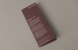
Re:Publik's identity follows the same logic as the positioning: restrained and practical, but not institutional. It borrows from academic literary material, while the wordmark, colors and layout choices keep it from feeling too formal.
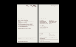
The palette is inspired by classic Nordic design and gives the material a slightly analogue feel. The distinctive wordmark typeface brings movement and character, while the serif body typeface adds a literary tone. Clear hierarchy and simple layout rules make Re:Publik's content easy to read across formats.

Re:Publik's identity was designed for text-heavy communication: Instagram posts, programme sheets and material produced together with collaborators.
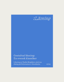
The colon from the logo became a point of orientation across the identity. In the wordmark as part of the name – in the visual system as a format marker for the programme communication. Set in the same typeface and placed in the upper right corner, almost like a dog ear, it becomes a recurring gesture that creates a direct link between Re:Publik and its events.
The same simple elements are used across applications to keep production simple and give Re:Publik a consistent expression.


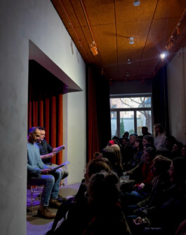
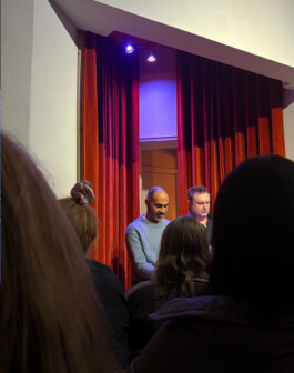
This April, Re:Publik presented their first public programme at Polisteatern in Stockholm, a reading based on Nadia Maghder's written dialogue "A Swedish classic". Performed by actors Peter Gardiner and Gabriel Pettersson.

RE:PUBLIK
Re:Publik is an independent non-profit organisation in Stockholm producing cultural programmes. They bring together institutions, artists, writers and researchers, using existing rooms and collections as starting points for new public formats. We helped Re:Publik clarify their positioning and developed their visual identity for print, digital and programme material.
SERVICES
Research
Workshop
Positioning
Logo
Visual Identity
Editorial Design
Social Media
YEAR
2026

We started with a workshop on how Re:Publik could be understood from the outside.
Re:Publik acts as a link between cultural institutions, contemporary practitioners and the public. The workshop focused on making this position easier to communicate, culminating in strategic recommendations around communication and positioning that could hold both the academic depth of their practice and a more open public invitation.

Re:Publik's identity follows the same logic as the positioning: restrained and practical, but not institutional. It borrows from academic literary material, while the wordmark, colors and layout choices keep it from feeling too formal.
The palette is inspired by classic Nordic design and gives the material a slightly analogue feel. The distinctive wordmark typeface brings movement and character, while the serif body typeface adds a literary tone. Clear hierarchy and simple layout rules make Re:Publik's content easy to read across formats.

Re:Publik's identity was designed for text-heavy communication: Instagram posts, programme sheets and material produced together with collaborators.
The colon from the logo became a point of orientation across the identity. In the wordmark as part of the name – in the visual system as a format marker for the programme communication. Set in the same typeface and placed in the upper right corner, almost like a dog ear, it becomes a recurring gesture that creates a direct link between Re:Publik and its events.
The same simple elements are used across applications to keep production simple and give Re:Publik a consistent expression.


This April, Re:Publik presented their first public programme at Polisteatern in Stockholm, a reading based on Nadia Maghder's written dialogue "A Swedish classic". Performed by actors Peter Gardiner and Gabriel Pettersson.
© 2026 Studio Dim | info@studio-dim.com
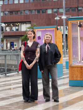
Studio Dim is a creative practice for communication, design and art run by Ida Dimić and Henrietta Andersson. Currently based between Stockholm and Berlin.
We want to use our expertise to support people and groups focused on social justice, cultural change and community.
Recent projects include a campaign for Sweden's largest democratic arena, curation and exhibition design for a queer museum and a new website for an indie cinema.
If you're working on something you care about, we'd love to hear from you at hi@studio-dim.com
Follow us: @studio__dim

Studio Dim is a creative practice for communication, design and art run by Ida Dimić and Henrietta Andersson. Currently based between Stockholm and Berlin.
We want to use our expertise to support people and groups focused on social justice, cultural change and community.
Recent projects include a campaign for Sweden's largest democratic arena, curation and exhibition design for a queer museum and a new website for an indie cinema.
If you're working on something you care about, we'd love to hear from you at hi@studio-dim.com
Follow us: @studio__dim